
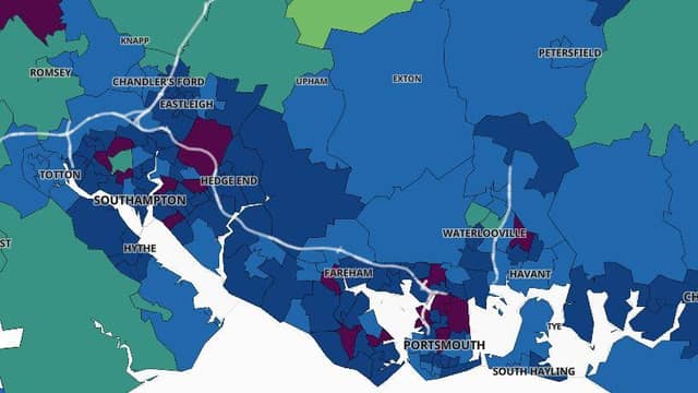

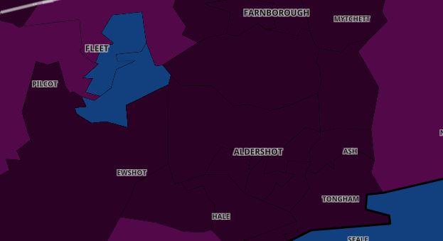
A map on the Covid dashboard website shows how high rates were on January 2 and how much they had decreased by on February 9.
We have pulled together a comparison between before lockdown began and after weeks of the restrictions.
MORE: coronavirus coldspots where infection rates are lowest in Hampshire | 9 Portsmouth neighbourhoods with most coronavirus cases
You can see that in our gallery below.
Make sure to click through all the pages.
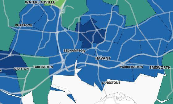
We have included a key to explain what the colours mean.
You can subscribe here for unlimited access to Portsmouth news online - as well as fewer adverts, access to our digital edition and mobile app.
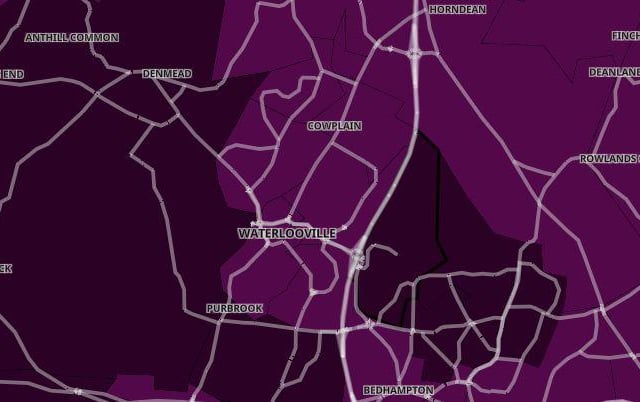
10. Waterlooville
On January 2, the majority of areas had a rate of 400 and above. Photo: -
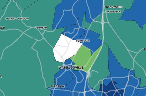
11. Waterlooville
On February 9, the majority of areas had a rate of 199 or below, with two areas having a rate below 100 and one area having ‘suppressed’ the virus. Photo: -
3 / 6