
'Quite smart...get rid of Nike asap': Mixed Portsmouth verdict over 2025-26 home kit
Pompey fans have had their say over the club’s new home shirt for the 2025-26 campaign.
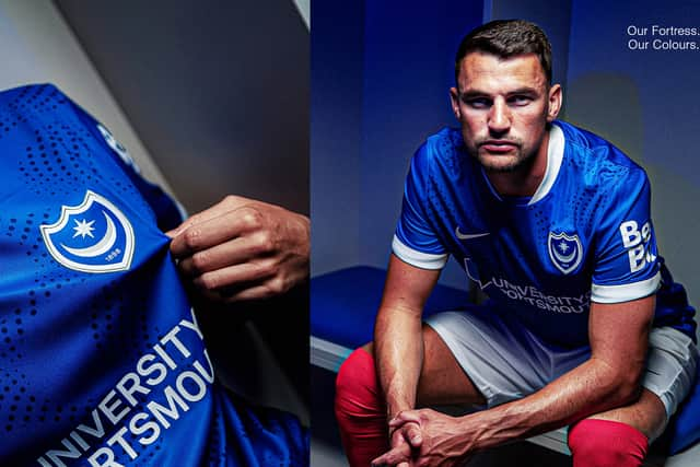
Pompey fans have been split over the 2025-26 home kit, which was revealed on Friday morning.
Of course, the royal blue remains on the background of the shirt, while a ‘striking drench blue dotted wave pattern that flows across the front and lower back.’
There is an introduction of a white and platinum detailing on the collar as well as on the cuff of the sleeve and the side panels. Meanwhile, white shorts and red socks are in place as ever ahead of the new season.
University of Portsmouth maintain their spot as the front-of-shirt sponsor, while Aura.com come in on the back of the shirt. With the AI company coming in as a club partner, new signage has been put up across Fratton Park using a retro design, which was noticed by some supporters online.
Although there was some belief of a potential retro home shirt for the upcoming campaign, the new threads has received a mixed response on social media as the Fratton faithful delivered their verdict on the 2025-26 kit.
Here are some of the best reactions on X.
Pompey verdict over 2025-26 home shirt

@DavesLittleBits: I love a simple kit so this is right up my street. Best one for a while.
@_SReid: Very clean. Not the best. Let’s hope for a black/gold 3rd.
@ollie_warren99: To be honest, it’s actually not that bad. As Nike templates go….We all got a bit over excited.
@POMPEYBENNY: Well, the hype and excitement of yesterdays new signs on the Fratton End have quickly been washed away…
@LukeEllisPUP: It’s nice, good kit. My kids like it, so that’s all that matters really.
@DanielE64141682: Quite smart.
@porgietalk: Man get rid of Nike asap. The club has been doing some much work with these retro kits and it's bought such a good feeling around kits and then they release this bland template design. #Pompey 0 personality. Games gone.
@01Southcoast: Don’t mind that - nice and clean. Conservative home kit usually means something a bit out there for away or 3rd shirt.
@OllieWoods1: The kit is ok probs 5/10, nothing necessarily wrong with it just very generic and a bit boring, the video however is class, and for no reason what so ever I have a good feeling about the away kit.
@HancockAnalysis: Classy, blue, a little boring - I like it!
@_JLWilson: Really like the collar, not sure on the spots. I don’t hate it, but I don’t love it.
@olliejoell1606: Not the worst Nike kit we’ve had. But I think every Pompey fan got their hopes up. But here we are again. Another boring Nike template.
@HarvMarksy: It’s okay. Nothing spectacular but nice enough. A proper collar on it would make it so much better mind you.
@pfclowey: It’s not as good as I was expecting but still rate it Think we all got very over hyped lol.
@MarkCha77677382: I like this but its a shame its just another off the peg design. We need a new kit supplier. The back is always the same so no surprise on the layout. But not a terrible shirt for me last seasons was worse imo. Lets see what the away and third kits are like pup.
Your next Pompey read: Portsmouth boss reveals where transfer chase is going now as recruitment push continues